A redesign built
on research, not assumptions.
Directed research, strategy & cross-functional execution across 10 markets — enrollment tripled in 8 weeks.
0×
More Sign-Ups
15% → 45% enrollment
+0%
Conversion Lift
Across 10 markets
0%
Usability Score
Up from 32%
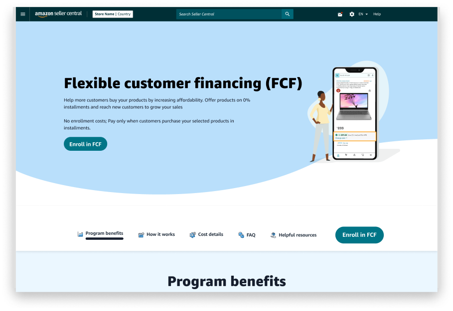
Original Design · Before Redesign
What the data demanded
Before any wireframe was drawn, three research signals redefined the brief — and shaped every decision that followed.
Research Approach
Behavioral Data
Conducted 3 focus groups — with 7, 7, and 8 members — to observe real decision-making patterns around financing options.
Competitive Benchmarking
Audited multiple local financial competitors — Klarna, Clearpay, PayPal, and Pix-based BNPL — to identify best practices and industry gaps.
Contextual Inquiry
Shared a clickable Figma prototype containing 20+ samples with participants to capture in-context reactions and navigation behavior.
Friction we found in the field of Sellers
Key Gap Identified · 01
Critical gaps in seller communication
Sellers lacked clarity on how FCF integrates into their workflow. Key information was buried or missing entirely — leaving sellers unable to make an informed decision to promote the feature.
- Information architecture gap
Key Gap Identified · 02
High sensitivity to seller fees
Fee structure was a primary friction point. Sellers perceived the cost as unclear or unfair — not because fees were high, but because they were never explained transparently on the page.
- FCF fee structure not clearly shown
Key Gap Identified · 03
Page lacked trust & clear hierarchy
- Missing trust signals
- Poor visual hierarchy
- Scattered, hard-to-scan content
- FCF fee structure not clearly mentioned
- No trust signals present
- Scattered content structure
Redesign Walkthrough
Competitive Dynamics
Europe Competitive Dynamics
Strong BNPL Dominance
- Klarna, Clearpay, PayPal are widely accepted across merchants
- Customers are already trained to use "Pay Later"
Key Insight
FCF is not creating new behavior — it's competing on convenience inside Amazon.
Brazil Competitive Dynamics
Installment Culture is Native
- Installments have existed since the 1990s retail system
- BNPL adoption 50%+ in e-commerce
- Pix dominates payments — 91% adult usage
Key Insight
In Brazil, financing is not a feature — it's an expectation.
India Competitive Dynamics
Installment Culture is Booming
- BNPL adoption surpassed 18% of e-commerce transactions by 2022
- Bajaj Finserv plays a dominant role in shaping consumer credit behaviour
- Only 4.8% of Indians hold a valid credit card — installments fill that gap
Key Insight
In India, financing isn't a perk — it's a conversion lever. Without it, a significant share of users can't complete the purchase.
"Designing payments is designing decisions."
How I got there
Three phases. Every decision backed by evidence — not guesswork.
Research & Discovery
Understanding real users before touching any design tools.
0
User interviews
Real people, real frustrations
0+
Heatmap sessions
Where eyes and clicks actually went
0
Design variations
A/B tested to find what worked
Design & Ideation
From rough sketches to polished prototypes — guided by research insights.
0
Wireframe rounds
Iterated based on feedback
Interacting with multiple product owners
0
Languages designed
Localized layout for each
English, French, Portuguese, Spanish, Dutch
What wasn't working
Before the redesign, the FCF landing page had 7 clear problems — each one quietly pushing users away.
No trust signals
Nothing told visitors "you can trust us" — no badges, no reviews, no security cues
Unclear buttons
Sign-up buttons were buried and vague — users didn't know what to click or why
Accessibility gaps
Low-contrast text, missing labels, broken keyboard navigation — excluded many users
Poor visual hierarchy
Everything looked equally important — the eye had nowhere to go
Misplaced images
Photos were decorative, not helpful — they consumed space without adding meaning
Scattered content
Related info was spread across the page — users had to hunt for basic answers
No directional flow
Nothing guided visitors through the page — they had to figure it out alone
What I set out to fix
With a hard launch date, 10 international markets, and 5 languages to support — the redesign had to solve real problems, fast.
Improve sign-up conversion across all markets
Redesign for 10 international markets simultaneously
Ship within a fixed 8-week timeline
Support 5 languages from day one
Conduct proper user research before designing
Test with real users before final launch
Build and compare multiple design variations
Retest after changes to confirm improvements
The numbers changed.
After launching across 10 markets, every key metric moved — significantly. Here's what the data showed.
0×
Enrollment
15% → 45%
+0%
Conversions
Avg across markets
0%
Usability score achieved
Up from 32%
+0%
Design Quality
Heuristic score
Before vs After breakdown
What I discovered
Trust is the #1 conversion lever
Adding trust signals (security badges, brand logos, social proof) had the highest single impact on sign-up rates. Users decide in seconds whether to trust a page.
One clear CTA always wins
Removing competing buttons and focusing users on a single action dramatically reduced confusion. Every extra button was a reason not to click the right one.
Design is cultural, not just visual
What resonates for US audiences can fail completely in Japan or Germany. Local layout conventions, trust patterns, and reading behaviors differ significantly.
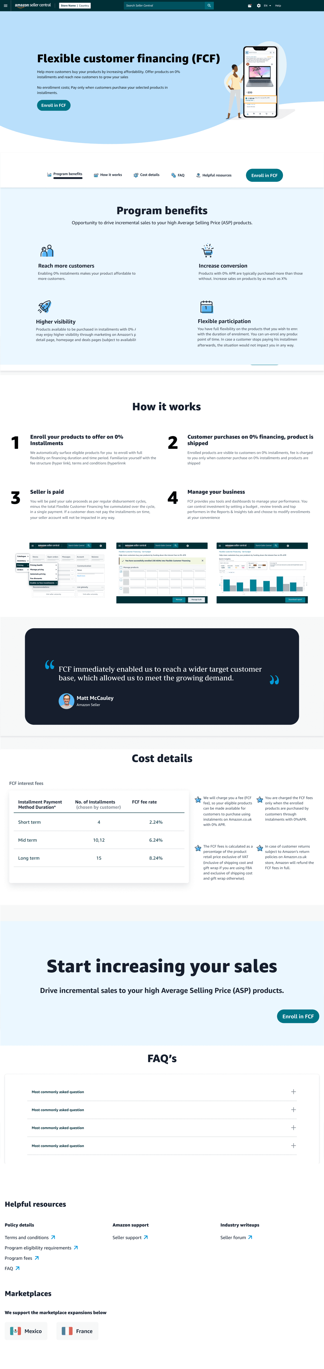
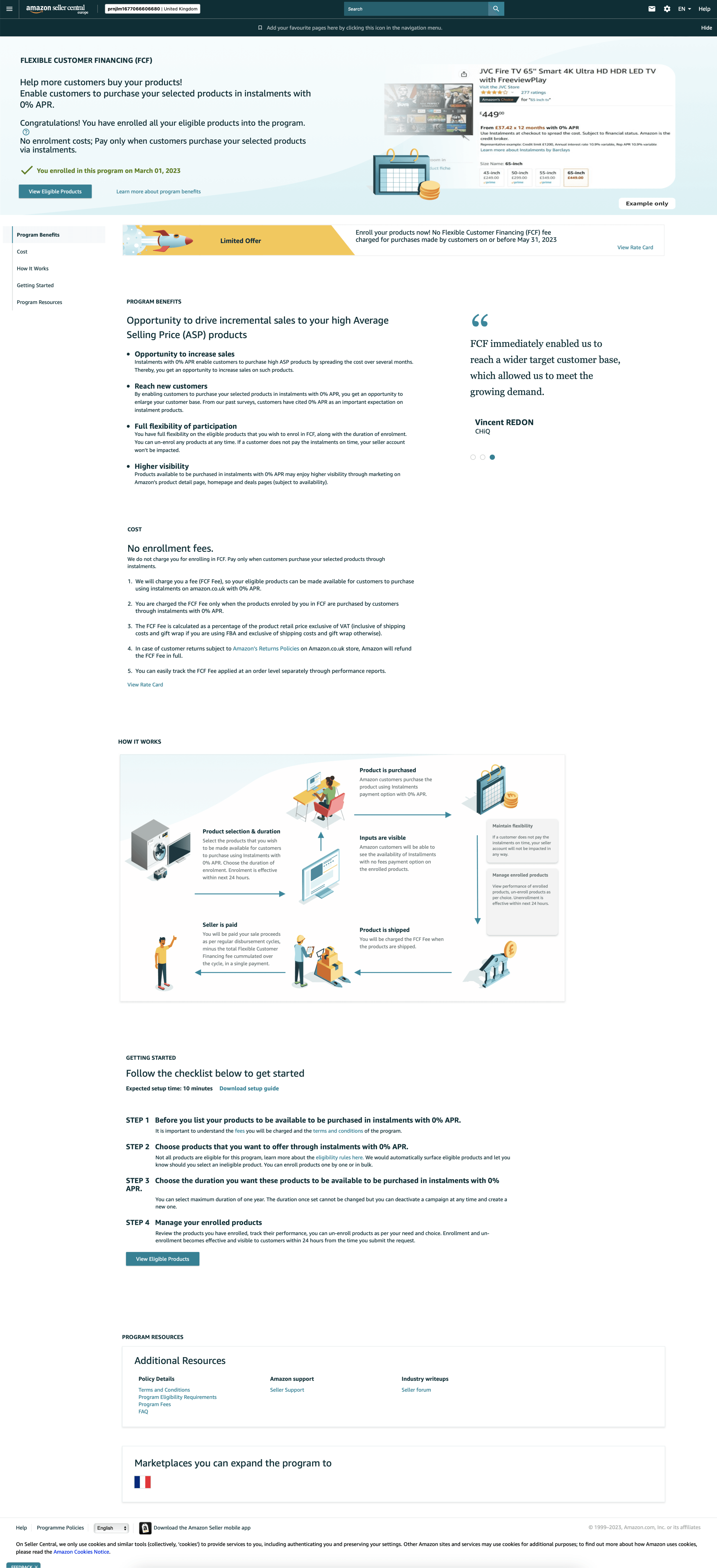
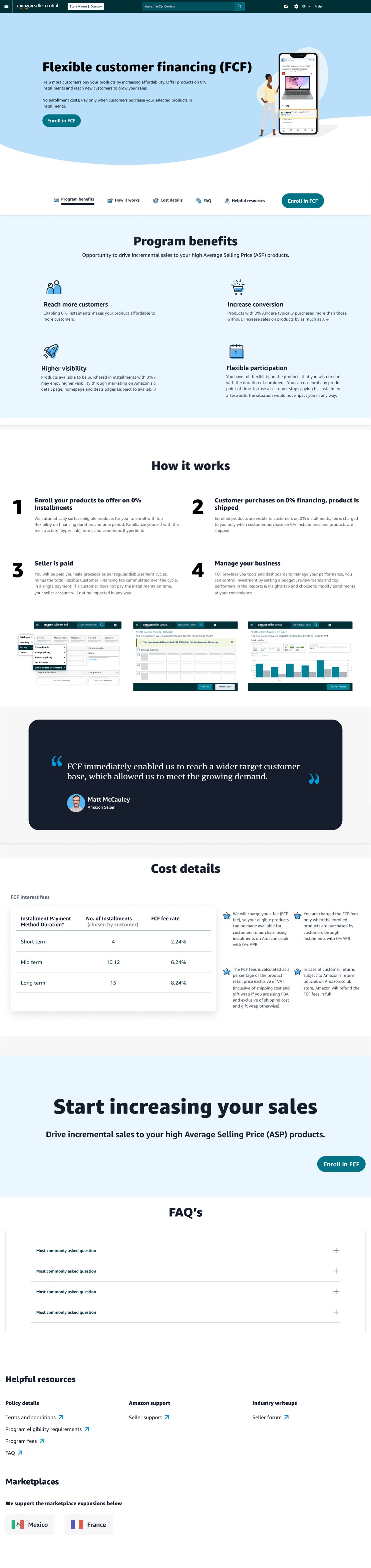
The proof is in
the pixels.
Browse the old design, the new one, or compare them side by side — every change you see was driven by real user research.
Built fast.
Built for scale.
An 8-week sprint across 10 markets — every constraint became a forcing function for sharper design decisions.
Timeline
8wks
March – May 2024
Hard launch deadline
My Role
ICDesigner
End-to-end ownership
Alongside 2 engineers
Reach
10Markets
Simultaneous global launch
5 languages supported
Work with me
Got a product that
needs rethinking?
I turn hard UX problems into measurable outcomes — from research to shipped design. If your product needs a sharper lens, let's talk.
3×
Avg. impact delivered